Embedding Plots in Jekyll Blogs
I’ve been meaning to write posts using plots. Also, generally, I would like to create plots that I an embed in my browser, as opposed to taking images and using those.
I plan to use python to create the graphs, so the packages I use should take python code as input.
Bokeh
With Bokeh, I created the following interactive plot.
Plotting
I can make plots! And I have a lot of control over them. And they’re in html form, so I can generate them by adding the following to my python code:
html = file_html(p, CDN,"Sine vs. Cos. Sample Plot")
outFile = open("sinCos_3_13_2018.html",'w')
outFile.write(html)
outFile.close()
This allowed me to save my work as an html file, and then include the html file. The only thing to remember? Remove <!DOCTYPE html> from the top of the code.
What code did I use?
When using standard minima, it was relativley easy to embedd the plot. I just generated an html file using the code below.
from numpy import pi, arange, sin, cos
from random import randint

from bokeh.plotting import output_file, figure, show
from bokeh.palettes import Viridis

from bokeh.resources import CDN
from bokeh.embed import file_html

x = arange(-10*pi, 10*pi, pi/50)
y = sin(x)
y2 = cos(x)
palette = Viridis

def chooseColor(palette):
    """ chose/coordinate the colors used on the graph """
    paletteKeys = list(palette.keys())
    paletteHeight = len(paletteKeys)
    rowNum = randint(0,paletteHeight-1)
    chosenRow = paletteKeys[rowNum]
    paletteSection = palette[chosenRow]
    sectionLen = len(paletteSection)
    colNum = randint(0,sectionLen-1)
    return(palette[chosenRow][colNum])

sinColor = chooseColor(palette)
cosColor = chooseColor(palette)
titleColor = "whitesmoke"
lineColor = "whitesmoke"
output_file("sinCos.html")

p = figure( x_range=(-6.5, 6.5),
            y_range=(-1.1, 1.1),
            title="Sine vs. Cosine")

p.title.text_color = titleColor
p.background_fill_color = "#030100"
p.border_fill_color = "#030100"
p.border_fill_alpha = 0.90

p.circle(x, y, color=sinColor, legend="sin(x)")
p.circle(x, y2, color=cosColor, legend="cos(x)")

p.xaxis.axis_label = "x-axis"
p.xaxis.axis_label_text_color = titleColor
p.xaxis.axis_line_color = lineColor
p.xaxis.major_tick_line_color = lineColor
p.xaxis.major_label_text_color = lineColor
p.xaxis.minor_tick_line_color = lineColor
p.xaxis.minor_tick_line_alpha = 0.25

p.yaxis.axis_label = "x-axis"
p.yaxis.axis_label_text_color = titleColor
p.yaxis.axis_line_color = lineColor
p.yaxis.major_tick_line_color = lineColor
p.yaxis.major_label_text_color = lineColor
p.yaxis.minor_tick_line_color = lineColor
p.yaxis.minor_tick_line_alpha = 0.25

p.legend.border_line_color = lineColor
p.legend.background_fill_color = "#17171c"
p.legend.label_text_color = titleColor
p.legend.label_text_alpha = 0.5

show(p)
html = file_html(p, CDN,"Sine vs. Cos. Sample Plot")
outFile = open("sinCos_3_13_2018.html",'w')
outFile.write(html)
outFile.close()
Then, I included it using the _includes\filname.html and {% include filename.html %} folder and inclusion system standard to jekyll.
Generate the plot
This code generated the plot, and saved the results of the necessary <div> and
<script> that then get included.
from numpy import pi, arange, sin, cos
from random import randint

from bokeh.plotting import output_file, figure, show
from bokeh.palettes import Viridis

from bokeh.resources import CDN
from bokeh.embed import components

x = arange(-10*pi, 10*pi, pi/50)
y = sin(x)
y2 = cos(x)
palette = Viridis

def chooseColor(palette):
    """ chose/coordinate the colors used on the graph """
    paletteKeys = list(palette.keys())
    paletteHeight = len(paletteKeys)
    rowNum = randint(0,paletteHeight-1)
    chosenRow = paletteKeys[rowNum]
    paletteSection = palette[chosenRow]
    sectionLen = len(paletteSection)
    colNum = randint(0,sectionLen-1)
    return(palette[chosenRow][colNum])

sinColor = chooseColor(palette)
cosColor = chooseColor(palette)
titleColor = "whitesmoke"
lineColor = "whitesmoke"
output_file("sinCos.html")

p = figure( x_range=(-6.5, 6.5),
            y_range=(-1.1, 1.1),
            title="Sine vs. Cosine")

p.title.text_color = titleColor
p.background_fill_color = "#030100"
p.border_fill_color = "#030100"
p.border_fill_alpha = 0.90

p.circle(x, y, color=sinColor, legend="sin(x)")
p.circle(x, y2, color=cosColor, legend="cos(x)")

p.xaxis.axis_label = "x-axis"
p.xaxis.axis_label_text_color = titleColor
p.xaxis.axis_line_color = lineColor
p.xaxis.major_tick_line_color = lineColor
p.xaxis.major_label_text_color = lineColor
p.xaxis.minor_tick_line_color = lineColor
p.xaxis.minor_tick_line_alpha = 0.25

p.yaxis.axis_label = "x-axis"
p.yaxis.axis_label_text_color = titleColor
p.yaxis.axis_line_color = lineColor
p.yaxis.major_tick_line_color = lineColor
p.yaxis.major_label_text_color = lineColor
p.yaxis.minor_tick_line_color = lineColor
p.yaxis.minor_tick_line_alpha = 0.25

p.legend.border_line_color = lineColor
p.legend.background_fill_color = "#17171c"
p.legend.label_text_color = titleColor
p.legend.label_text_alpha = 0.5

show(p)
script, div = components(p)

outFile = open("sinCos_4_17_2018_script.html",'w')
outFile.write(script)
outFile.close()

outFile2 = open("sinCos_4_17_2018_div.html",'w')
outFile2.write(div)
outFile2.close()
Embed the <div> and <script>
To embed the <div> and <script> files, I added them under the _includes folder. Then, I included them in this blog post’s markdown file using
{% include 2018/03-16/sinCos_4_16_2018_div.html  %}
{%  include 2018/03-16/sinCos_4_16_2018_script.html  %}
Getting the graph formatting
Let the post know it has a bokeh plot
I edited the post’s formatter to include the statement
bokeh: true
---
Include the bokeh plot formatting
To get the graph to render, I needed to include the following in my post layout, stored under _layouts\post.html.
{%if page.bokeh  %}
<link rel="stylesheet" href="https://cdn.pydata.org/bokeh/release/bokeh-0.12.15.min.css" type="text/css" />
<script type="text/javascript" src="https://cdn.pydata.org/bokeh/release/bokeh-0.12.15.min.js"></script>
{% endif  %}
Note that I need to have the correct version of bokeh listed (0.12.15).
As bokeh improves, I will need to come back and list the proper bokeh versions’ stylesheet calls to render the graphs.
Observations
Bokeh Pros
- Interactive Plots
- Plot source is my own server
Bokeh Cons
- Not able to figure out how to creat an interactive Graph in Bokeh using the directions for the Visualizing Network Graphs tutorial. Problems specifically stemmed from the fact that in version 0.12.14 or 0.12.16, which I was using, the package
bokeh.modelsis missing the classesGraphRendererandgraphs.
Matplotlib
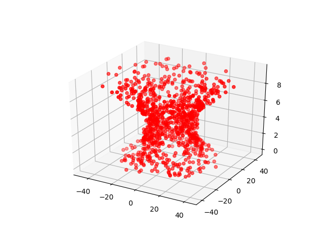
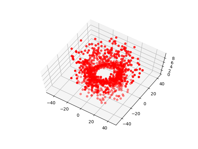
I can make many impressive graphics using Matplotlib, such as different views of a vortex, shown below. This is a standard tool for all sorts of academic work with Python.
Here’s an example of a 2-D embeddable and interactive image.
The code for this, came from here, with a minor tweak (adding lines 3 and 6) so that I could save.
1
2
3
4
5
6
import matplotlib.pyplot as plt, mpld3

fig = plt.figure()
plt.plot([3,1,4,1,5], 'ks-', mec='w', mew=5, ms=20)
mpld3.show()
mpld3.save_html(fig,fileobj="testMpld3.html",no_extras=True,template_type="general")
Observations
My plots are not as easily pretty as in Bokeh or Plotly, but they’re functional. Also, the way the interactivity only works when activated by pushing the cross-like arrow button is really cool.
Matplotlib Pros
- Interactive 2-D Plots in HTML
- Graphs
- 3-D Plots
- Everything is on my computer
Other goodies include adding a navigation toolbar (to be used with GUIs on your computer or built into non-web apps, from my understanding) and animations.
Matplotlib Cons
- Difficult to create html embeddable images, especially for 3d plots.
- [Added April 15, 2018] The embedded plots are not responsive. I have wrapped the output html in a
divand given it a class, which helps, but in the long run, the plot will not reduce in size to fit a smaller screen. When working with fancier CSS, this may cause design flaws. See this post in a smaller browser setting for proof.
Plotly
With Plotly, I was able to create an interactive graph, rendered in the browser.
Running the Tutorial’s Example
I followed along with Plotly’s instructions for creating a random network graph very closely. My code is almost the same as written, but there are two slight modifications I needed to run the program from the command line.
Change to Networkx package
Python’s networkx package underwent a change between when the tutorial was released and when I ran the tutorial. The networkx.classes.graph.Graph class’s attribute adjacency_list() has been renamed to adjacency(). Thus, when running the code, I needed to change the section of the tutorial where we find nodes connected with each other to
for node, adjacencies in enumerate(G.adjacency()):Plotting
As usual, I ran python on my personal machine, instead of online or in a jupyter notebook. Because of this, the last line of the tutorial needs to be changed, from py.iplot to py.plot. This leaves the code I used as
py.plot(fig, filename='networkx_plotly_test1')Observations
Plotly Pros
- Makes interactive plots!
- It works with networkx
- The plots are relatively easy to embed. Just embed an
<iframe>...<\iframe>in the markdown file.
Plotly Cons
- I do not really own the graph. It is created and hosted on plotly’s site, and I load it into my page, such as I would a tweet, or soundcloud or youtube post.
- When you load the page, it takes a while for the graph to appear.